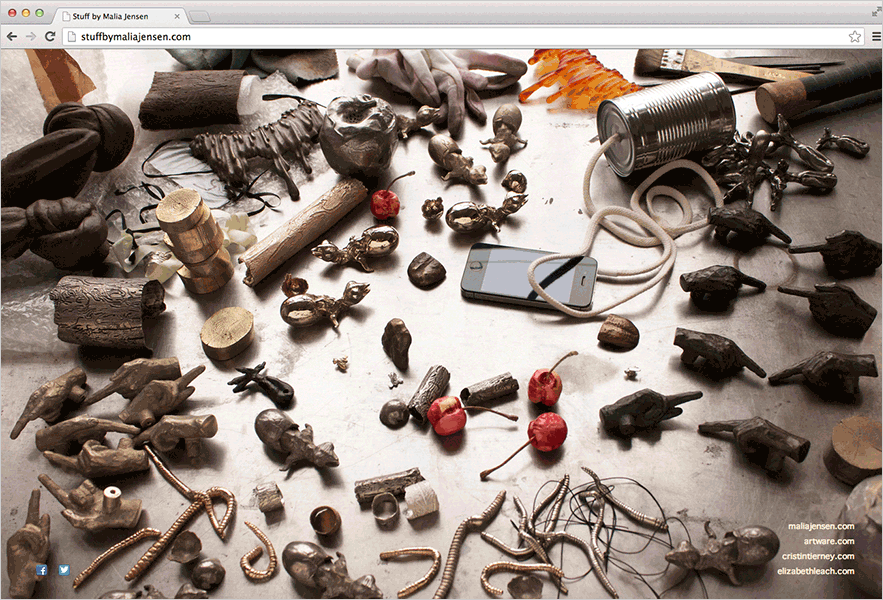
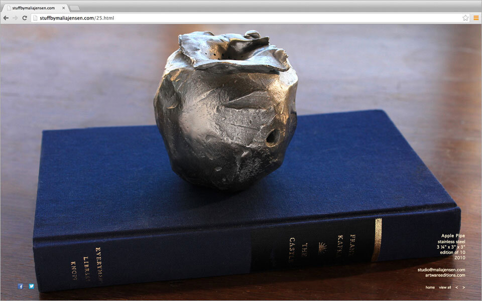
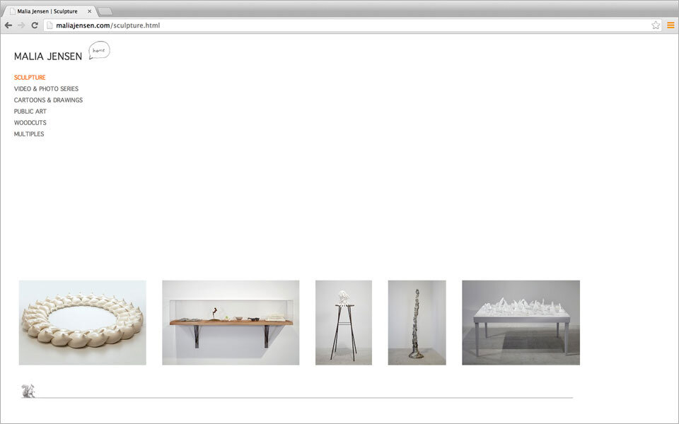
An artist with a long career needed a way to get a quick overview and impression of her vast oeuvre. Keep in line with the artists approach we separated the site content into “images” and “text.” A timeless responsive html website that I still enjoy looking at.
html
Artist Mikael Levin
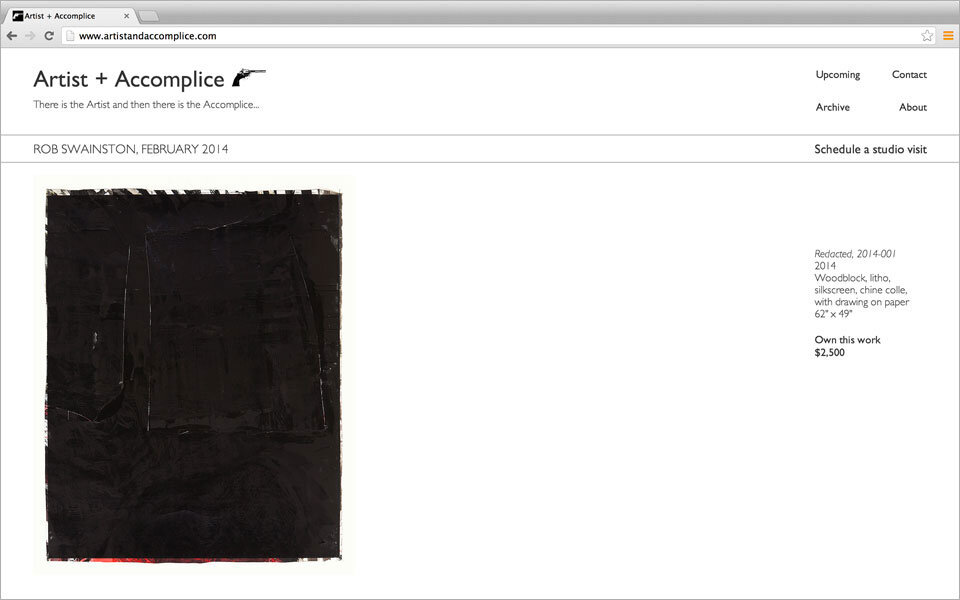
Mikael wanted a website that gave a minimalist website that gave an overview of his entire oeuvre on the opening page. We designed the sign project pages to reflect the way his work might be viewed in a gallery setting or as a book.


